qsecure Rebranding: A leap towards clarity and commitment
With more than a decade of experience in serving organizations across finance, healthcare, and technology, we are excited to unveil a complete rebranding of our company.
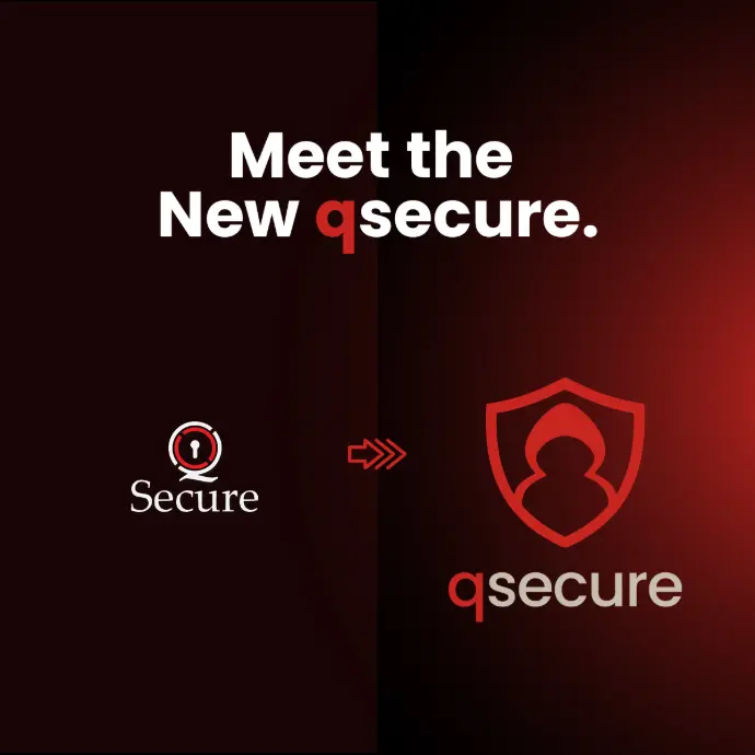
By the end of this month, QSecure LTD will assume a streamlined identity as qsecure, supported by a refined logo, updated colour palette, and an immersive website redesign.
This rebranding is more than a change of appearance: it reflects our dedication to delivering security and compliance solutions with greater precision, accessibility, and continuity.
The Case for Change
Since our founding, the cybersecurity sector has progressed exponentially. Threat vectors have grown in sophistication; regulatory requirements have multiplied; and the pace at which businesses must adapt has accelerated.
Throughout this period, our name and visual identity have remained largely static.
As we entered our next chapter, three imperatives guided our decision:
- Simplicity: A concise name that is easy to recall, pronounce, and write, both in conversation and online.
- Coherence: A consistent visual system that flows consistently across digital platforms, print materials, and client portals.
- Continuity: An evolution that honours the intellectual and technical foundations we have built, rather than discarding them.
By unifying under the single, lowercase “qsecure” and reimagining our brand elements, we align our public presence with the simplified, user-centred services qsecure offers behind the scenes.
Modern Visual Identity
Our rebranding initiative features a striking shield mark, designed in collaboration with prominent design firms and informed by extensive feedback from clients and partners.
Key features include:
- Sharper Geometry
The shield’s contours have been refined for clarity at any scale, whether as a favicon in a browser tab or as a display graphic on a conference banner. - Balanced Proportions
Subtle adjustments to line weight and curvature ensure that the symbol conveys both stability and approachability, acknowledging the human element in security work. - Modern Typographic System
We have adopted a bespoke typeface family with clear letterforms and generous spacing. This approach improves legibility in lengthy reports, dashboards, and presentations. - Harmonised Colour Palette
A reduced set of primary and secondary hues improves consistency across our website, mobile applications, and printed collateral. Each colour was chosen for accessibility and to meet contrast guidelines.
To guide all future usage, we have published a detailed set of brand guidelines available in our design showcase that specifies logo placement, clear space, acceptable colour variations, and usage dos and don’ts.
From “QSecure LTD” to “qsecure”
Transitioning from a legal entity name to a concise brand name may seem subtle, but it carries important implications:
- Global Recognition
Lowercase styling complements digital conventions (usernames, domains, APIs) and positions us for easier adoption in multilingual contexts. - Adaptive Flexibility
A succinct name fabricates more readily into subbrands, product lines, and project code names without undue length or confusion. - Streamlined Messaging
Marketing materials, social media handles, and email domains become cleaner, reducing the potential for typographical errors and misrouting.
The Website and Design Showcase
Our website has been reconstructed from the ground up:
- Intuitive Navigation
Menu structures prioritise the most sought-after resources, whitepapers, case studies, and compliance checklists so visitors find key information in two clicks or fewer. - Behind-the-Scenes Feature
The design showcase offers an annotated walkthrough of our creative process, from early concept sketches to the final logo lock-up. It also highlights the rationale behind our typography and colour selections. - Accessibility and Performance
Pages have been optimised for fast load times and tested against WCAG 2.1 AA standards to ensure equitable access for all users.
We invite clients and partners to explore the new site, offer feedback, and witness the full extent of our visual evolution.
Looking Ahead
This rebranding is not an endpoint but a milestone. In upcoming months, you will see qsecure applied to:
- Product Interfaces: Updated dashboards and reporting tools with the new visual language.
- Documentation: Technical manuals, API references, and user guides revised for consistency.
- Communication Templates: Client emails, proposal decks, and event materials refreshed to reflect our streamlined identity.
Our commitment remains steadfast: to support your security and compliance objectives with discipline, transparency, and responsiveness. The refined brand identity simply makes our promise clearer.
Conclusion
We extend our gratitude to the qsecure team, our design partners, and above all, our clients, whose insights have shaped this transformation. As you engage with our new brand, we welcome your observations and look forward to continuing our partnership under this revitalised banner.
Overlord BlackHat 2020
16 July 2020
eWPTXv2 Review
27 May 2020